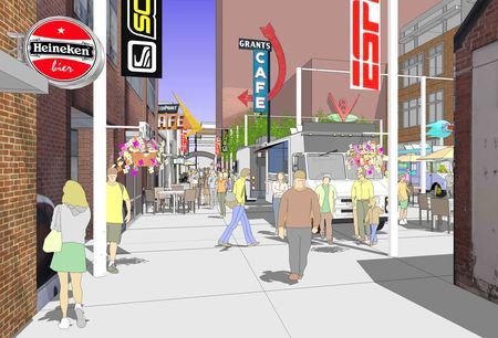
I recently created a blog post about visualizing a repurposed alley in Boulder, Colorado using quickly generated hand drawings. That effort evolved into a more detailed exploration of the alley improvements in the format of a presentation SketchUp model.
This colllection of images show how I constructed the SketchUp model which revealed a series of alternative alley uses, shadow studies and eye-level views. I learned from this exercise that there are design projects that may not require any drawings to communicate their basic concepts and that a well crafted SketchUp model may be more than adequate to convey your big idea.
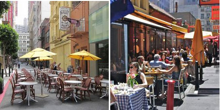
Repurposed Alleys. Many downtown service alleys are being converted to commercial uses such as restaurants, concert venues and special events. These photos are from two alleys in San Francisco that were transformed into outdoor dining spaces during certain hours of the day and then converted back to their original service use all other times. These were the inspiration for how I approached building the SketchUp model (below).
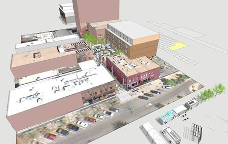
Base SketchUp Model I call this type of SketchUp model a “stage set model” for it is constructed with no more than a series of empty shapes with photographic facades applies to each face. I photographed all of the existing buildings and applied them to specific faces of the model. The resulting 3D SketchUp model was accurate enough to convey the existing neighborhood condition and spaces between buildings. The base image (streets and sidewalks) was saved from Google Earth.

Strategic Model Views. You can see from these two views that there is a large open space in the central portion of the alley. I developed several different design scenarios using that space as an outdoor food court with food trucks (shown) or as an art fair with tents, or even as an outdoor movie theater.
Each alternative was saved on a different layer in the model. I then established a series of more than 10 model scenes (views) that showed the alley from above and at eye level. Those views were very helpful for studying and documenting how the sun cast shadows at different times of the day and season.
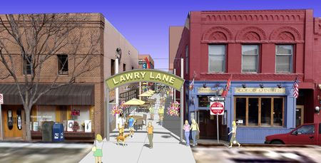
Alley Entrance Signage. This view angle of the Lawry Lane alley entrance was established as if I were observing from a second floor window across the street. The building facades are from digital photographs I took during a site visit. I constructed the sign, furniture and populated the model with a mix of 2D and 3D people, plants and other elements to establish the character of the alley space.
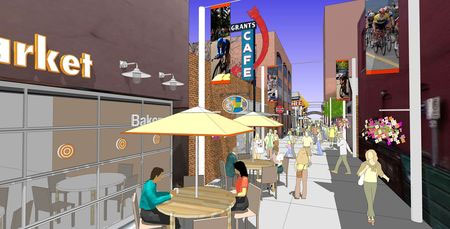
Alley SketchUp Entourage. Look carefully at the many different elements that have been placed into the basic alley model. I added 3D sign letters to the building facade, decorative “buttons” on the glass storefront, 3D and 2D people, custom umbrellas with red banding, and regularly spaced poles with banners. I added the red colored stripe on the banners to coordinate with the umbrellas and inserted images of bicycle racers that I photographed at a local competition. I fabricated the Grants Cafe sign from an image I downloaded from the internet and made into a SketchUp component.
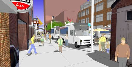
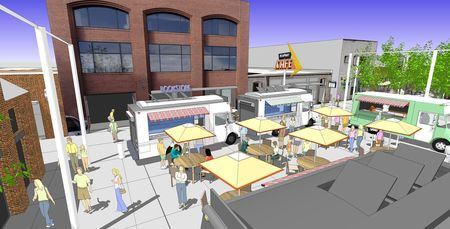
Central Food Court. I created a scene with several food trucks (downloaded from SketchUp 3D Warehouse) surrounding an outdoor seating area with shade umbrellas. This important urban space adjacent to the alley was developed with three different design options: food court, arts festival and outdoor movie theater. I exported jpegs of the three options from these two overhead and eye-level views.
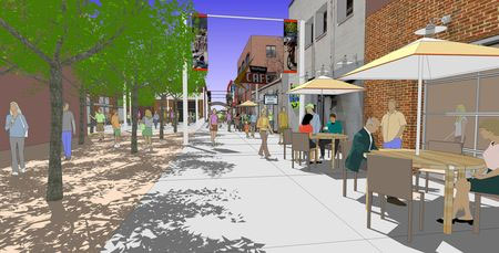
Strategically Placed Shade. This scene included a small pocket park adjacent to the alley planted with shade tress. I positioned the sun angle in such a way to cast tree shadows across the alley surface. Those shadows in combination with the umbrella shadows enhanced the setting. If I had more time to invest in the model detail, I would have added some elements to the table surfaces and seating in the pocket park. Flower pots and additional landscaping in the park would have also been worth adding to the model.
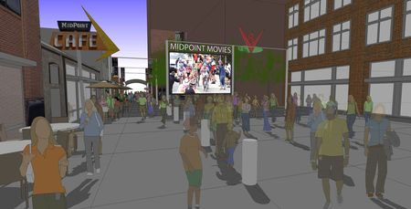
Night Movie Scene. This outdoor movie theater scene wasn’t easy to create alone in SketchUp. I established the basic view and then added the bike race photograph and a dark gray overlay in Adobe Photoshop. Given more time, I could have created a more successful night time effect using other graphic alternatives. I don’t think this scene was very convincing - especially when you see hard shadows beneath each individual!
If you have a design project that has a high level of complexity and the need to be represented with multiple alternatives and views, consider building a semi-detailed SketchUp model and export different views for your presentation. One last note: all of my model views were exported at a high resolution 4000 pixels wide and saved as jpegs. Each had a consistent horizontal format and dimension.
~~~~~~~~~~~~~~~~~~~~~
Published By
Arka Roy
www.sketchup-ur-space.com
~~~~~~~~~~~~~~~~~~~~~
No comments:
Post a Comment