Wednesday, January 31, 2018

How to create new design scopes in sketchup with v-ray 3.6 and VR Scans

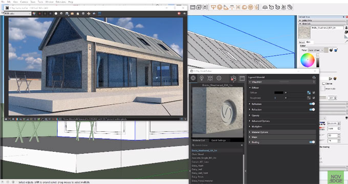
This sketchup video tutorial sheds light on the new design scopes by combining v-ray 3.6 and VR scans in sketchup. The tutorial is derived from a study of architecture interior and exterior project. The tutorial is conducted by Vessel Mikhaylov, a master degree holder from Technical University of Denmark.

Vessel highlights some of the new and exciting features in v-ray 3.6 for sketchup.

V-ray 3.6 for sketchup facilitates the users to render anything from rapid design model to most complicated 3d scenes. Rendering speed is very fast and one can design rapidly with the interactive rendering mode. Given below, some of the new features in v-ray 3.6 for sketchup.

a. Enhancements with UI and workflow
b. Greater speed
c. Enhancements with materials and textures
d. GPU rendering enhancements

V-ray 3.6 contains a new lighting algorithm known as adaptive lights to accelerate the rendering process considerably particularly in scenes where there are lots of light sources.

Lots of new materials and textures are included in this new version. The VR scan material is now supported and it allows to apply the curves groups scanned material technology in your project.

Besides, there are various types of GPU rendering enhancements like the hybrid rendering system. Displacement in aerial perspective is also now supported on the GPU.
Watch the following video tutorial to get more detail information.
How to create new design scopes in sketchup with v-ray 3.6 and VR Scans

~~~~~~~~~~~~~~~~~~~~~~~~~~
Published By
Rajib Dey
www.sketchup4architect.com
~~~~~~~~~~~~~~~~~~~~~~~~~~

Cube Cities are a unique thinking

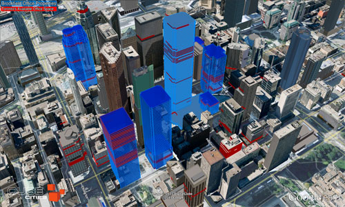
Greg Angevine is the founder of Cube Cities and with his innovative team he has made some unique featured cities which are different from the normal thoughts. He has spent a lot of years in his career to find some idea from some of the largest and most elaborately detailed cities all over the world. From his survey over this various kind of cities he has made finally very useful, floor-level visualizations for the three-dimensional industry and it is full of uniqueness. This article will throw the light on Greg’s innovative ideas and works.

About Cube Cities: It is the name of the company, given by Greg and it was founded in the year 2010 worked on creating and expanding a floor-level imagination platform which is reflects the transparency in the real estate markets. Before the arriving of Cube Cities it was not possible to fast visualize real estate data in 3D and now it became very effective for the real estate organizations. Cube Cities has changed the slow graphic of the real estate market and has brought a huge amount of interest for the common people.

Reason to be in the real estate modeling industry: Though Cube Cities is a full time and evolved company in real estate industry but before it Greg had worked with a commercial real estate agency in a research capacity that gave him the experience. Working with the real estate agency gave him the experience of the sources of firm and maintaining the data, also provided with the information about the techniques by which generally brokers grasp the data of produce researches to make a good communication in trending markets. Everyone is knowledgeable about the nature of the commercial real estate; it is very competitive field and has so much high-quality challenging data, to overthrow this Greg and his team has a build a method. The method can help users to weight their data and offer them different complementary tools to build their own visualizations. This is a new and developed technology that can create thousands of floor-level building models quickly and help to connect with users and become a useful important 3D mapping technology.

3D modeling is best in the real estate modeling industry: Real estate field is all about the location and views that can leave an effect in the construction process and give the project a well and furnished look. As 3D modeling can highlight each and every detail clearly so by using it modelers can highlight the main parts of their model and give the model a lively look.

Most challenging city model: Greg has designed many famous and big cities all around the world but according to him among them the most challenging and interesting model is Manhattan. This city is full of beauty in structures of every building; this city is consisted with various urban developments that give the city so much thickness that can’t find any other city. SketchUp has detailed the diversity in the buildings and made the iconic skyscrapers which are better than any procreated process. SktechUp is the only solution to create all kind of new and developed cities all over the world.

Things that SketchUp solves in a city model: SketchUp gives its users the ability to use 3D buildings with perfect geometry and high-quality photographic textures in any application. It is not easy to get the right a3erial imagery for building photorealistic models though it allows using the camera kind of features everywhere. A team of SketchUp modelers maintains a good number of photographers in selected cities which help to create high-quality models in any content.

Other extensions used in Cube Cities with SketchUp: Though SketchUp is an all-rounder tool but Greg is using software named Cesium, a mapping partner of SketchUp that emigrates the SketchUp models into it using SketchUp’s glTF export extension. Cesium is used in case of working with many SketchUp models loaded with unique javascript calls and can bear the extra load of 3D Tile Server that improve the loading speed and performance.

Besides this, the Cube Cities’ team has also worked with Matterport; this software that helps to see inside a building and tour for examining the original conditions of a space. Matterport also make the Cube Cities technology a perfect way to join floors or windows of a SketchUp model to virtual tour.

Future plans of Cube Cities: According to Greg, Cube Cities can be used to find indoor location or the location where the floor or partial area of a floor or other can be found. Besides that it can identify the problematic area or part of a building and solve them and provide public safety regulations also. In addition it is said that Greg is very much excited to see the combination and coordination of Cube Cities’ technology with SketchUp, Cesium and different mobile devices. All of them are different from each other but can become a huge versatile platform for the real estate industry.


Article Sourceblog.sketchup.com

Cube Cities are a unique thinking

~~~~~~~~~~~~~~~~~~~~~~~~~~
Published By
Rajib Dey
www.sketchup4architect.com
~~~~~~~~~~~~~~~~~~~~~~~~~~

Tuesday, January 30, 2018

Demo of 3D Offset, the newest sketchup extension

Wisext released 3D Offset, the newest sketchup extension that is used to offset various faces at several distances. The users can now offset surfaces in 3D.

The extension is compatible with SketchUp 8, SketchUp 2013, SketchUp 2014, SketchUp 2015, SketchUp 2016 and SketchUp 2017.

In order to apply it, just press a single button to begin the tool. Choose or deselect the faces and put the distances segregated by "-". Get the preview the offsetted faces. Press Enter to generate them.


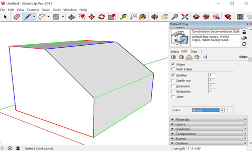
Now, go to window tab and click on default tray and check all the trays on the right hand side are selected.
To get more updates, go through the following link www.wisext.com
Watch the following video tutorial to get online demonstration of the extension.

~~~~~~~~~~~~~~~~~~~~~~~~~~
Published By
Rajib Dey
www.sketchup4architect.com
~~~~~~~~~~~~~~~~~~~~~~~~~~

Wall Thickness for 3D Printing

Wall thickness is necessary when you give your 3D model in print; otherwise, the 3D printer may not understand the thickness and thinness of the walls of your designs and print your model wrongly. So, it is the unwritten rule of designing 3D model in SketchUp to add wall thickness to your design. Paper-thin surfaces are strictly avoided for 3D printable models.

Setting the correct wall thickness needs your knowledge and proficient skills in designing. 3D printing materials and 3D models are two different subjects. The right wall thickness makes your 3D model print flawless, and it appears the same as you expect.

Choose the perfect wall for your 3D printing:

3D designing is an interesting field that grows rapidly in the world. This has made the craze for 3d printing materials used for various purposes. So, it is necessary to learn how to print a 3D model properly the way the design shows. In the designing software, you no need to work on the thickness surfaces to make your model. But when it comes to printing, it is an obligatory thing to add wall thickness. It helps 3D printer understand how thick of the surfaces are and print accordingly.

Wall thickness is defined as the distance between one surface and its opposite sheer surface. There are a few things that have an impact on choosing how much thickness you want for the surfaces. Materials would definitely come first in the list. The other factors that show a direct connection with the design are alignment, size and overall design.

A guide to proper 3D printing with the wall thickness:

Printing materials play definitely an important role, and depending on which, you can opt for the minimum thickness of your wall. It needs a basic knowledge of different printing materials. If your design needs strong materials like high detailed stainless steel or titanium, you can keep your wall thickness indeed thick as the materials allow you to do so.

The other factors are also there to watch on your 3D printing issue. Structure and design of your 3D models can be the decider of the wall thickness of the surfaces. For example, a print of vertical wall with 5mm2 wall surface needs 0.3mm wall thickness while a vertical wall with the 100mm2 wall surface needs 1mm thickness. If you are printing a horizontal wall with 100mm2 areas, then the wall thickness must be of 2mm. To set a proper wall thickness, you have to be correct while setting inputs like the size of the surface, the alignment (horizontal and vertical).

The materials like ceramics which are fragile need different attention from the strong and hard materials. The larger the model is, the stronger the structure must be – this is considered to be the general rule while printing on the comparatively fragile surface. For example, the ceramic model of 50 mm x 50 mm x 50 mm needs a minimum thickness of 3mm. a ceramic object with 100 mm x 100 mm x 100 mm has 6mm thickness for printable.

The other factors attached with 3D printing:

While preparing your model for 3D printing, you have to be very cautious while dealing with each factor of your design. The essential details are 

• It is common to give the primary attention on the wall with minimum thinness. But problems arise with the wall of maximum thickness. Thicker parts produce stress more than the thinner ones, resulting in a crack or break in the materials.
• To avert breaks on your print, it is always recommended to have an extra thickness of 5mm wall.


Your every design surface needs a recommended wall thickness to keep your model perfect for printing. It is an extraordinary process where you can visualize your virtual 3D models in real. So, having wall thickness is as much necessary as having a correct designing idea.
Article Source: i.materialise.com

Wall Thickness for 3D Printing
~~~~~~~~~~~~~~~~~~~~~~~~~~
Published By
Rajib Dey
www.sketchup4architect.com
~~~~~~~~~~~~~~~~~~~~~~~~~~

Monday, January 29, 2018

How to create the design of a camper van with the free version of sketchup make 2017

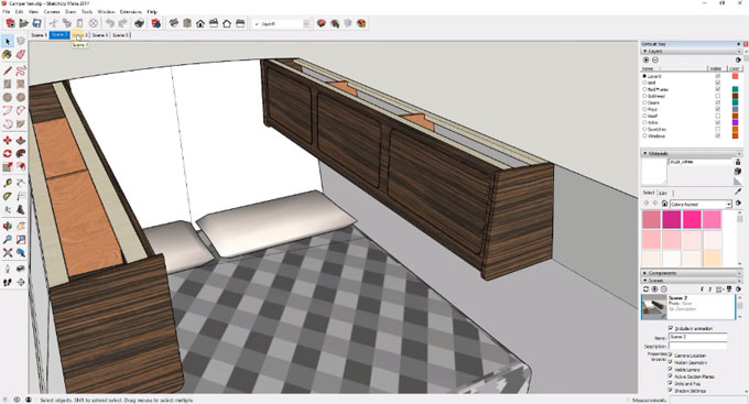
In this sketchup video tutorial, you will learn how to design your camper van in 3D by applying the free version of sketchup make 2017. The push pool tool & pencil tool in sketchup are used here for designing purpose.

To download the free version, click on the following link www.sketchup.com/download/all

To make the measurement accurate, the measuring unit is transferred to millimeter. To do this, visit window tab and click on preferences menu. Now click on template and choose would work in millimeters template to keep all your dimensions in millimeter to avoid working inches and fractions.


Now, go to window tab and click on default tray and check all the trays on the right hand side are selected.
To learn the complete modeling process, go through the following video tutorial.
After watching this tutorial, you will be able to create your own camper van by applying the methods provided in the video.
How to create the design of a camper van with the free version of sketchup make 2017

~~~~~~~~~~~~~~~~~~~~~~~~~~
Published By
Rajib Dey
www.sketchup4architect.com
~~~~~~~~~~~~~~~~~~~~~~~~~~

Thursday, January 25, 2018

Eneroth Flatten to Plane – The newest sketchup extension

Eneroth3 has developed Eneroth Flatten to Plane. This is the newest sketchup plugin available in extension warehouse. The plugin is compatible with SketchUp 2016, SketchUp 2017 and SketchUp 2018.

It is useful for various industries like Architecture, Construction, Education, Engineering, Film & Stage, Gaming, Heavy Civil, Interior Design, Kitchen & Bath, Landscape Architecture, Urban Planning, Woodworking, Other etc.

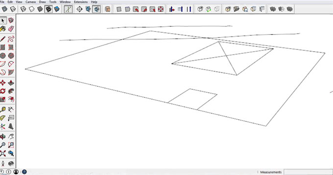
The plugin is used to flatten selected geometry to horizontal plane. It is ideal for imported DWGs where lines may contain various Z coordinates on what should have been a 2D drawing.

Download the plugin from extension warehouse extensions.sketchup.com

Eneroth Flatten to Plane – The newest sketchup extension

~~~~~~~~~~~~~~~~~~~~~~~~~~
Published By
Rajib Dey
www.sketchup4architect.com
~~~~~~~~~~~~~~~~~~~~~~~~~~

Wednesday, January 24, 2018

Developing a table in SketchUp

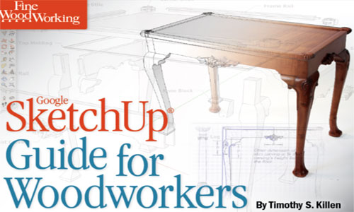
Tim Killen has wrote a wonderful eBook on woodworking and the in every chapter of the book there is a modeling detail of a piece of furniture like table, window, door etc. The book is named as “SketchUp Guide for Woodworkers” and the details are described there with tutorial videos and descriptions.

In the ninth chapter of the eBook, Tim has described the process of creating a nice Chamfered Post Table; it is a 1700 model and is one of the famous pieces made by Wallace Nutting in his Book “Furniture Treasury”. Tim has named the chapter nine “How to Begin and Develop a piece of Furniture” in SketchUp which is a very good sample to start and grow the original woodworking used in workshops.

Using SketchUp for modeling is actually a good idea as it will give a furnished draft of the original model which will be followed in time of original working in workshop.

Tim’s eBook is full of detailed and understandable steps with many still pictures, texts and tutorial videos. In his ninth chapter he started making the Table from developing and sketching the main structures like legs, stretches, sides and backside etc. and all the four edges of the legs are unique here called chamfers. These unique chamfers are closed with a flat triangular finish which gives the legs a mix look of old and classic with uniqueness.

In real without perfect planning or sketching, making these chamfers is not an easy job but in SketchUp, chamfers are started to making from one leg component and at last it ends by making all the four sharp and designed legs. Tim used various tools in SketchUp to give the chamfers their perfect look.

Article Source: finewoodworking.com

Developing a table in SketchUp


~~~~~~~~~~~~~~~~~~~~~~~~~~
Published By
Rajib Dey
www.sketchup4architect.com
~~~~~~~~~~~~~~~~~~~~~~~~~~

Saturday, January 20, 2018

SketchUp Weekend Workshop

SketchUp has probably been the widely used 3D designing and modeling application. People across the world use SketchUp to meet their designing needs in a satisfying way. The reason behind the surprising growth of the application is its user-friendly tools and features that embrace everyone having a designing spree. To offer a better communication between experts and learners, SketchUp workshop has been organized every year where important tools and effective tactics are discussed to bring the inside out of this application.

This weekend SketchUp workshop is planned with the Corvus Design, an architectural studio in Collooney, where participants will understand how to develop skills to have a better communication with their project. The courses are planned in a systematic way that helps designers learn step by step every detail of the project. Though there are no eligibility criteria, basic computer skill is preferable.

The workshop is complete based on to introduce you with the basics of SketchUp and how can develop project prototype quickly and effortlessly. Different 3D angles and floor plans will be discussed there where participants can intensely observe designing procedure. As believed conventionally, 3D modeling interprets your designing plan better and clear than other applications available. You can observe every step of designing in real time that makes the installation and layout of your project easier.

Artists will get a thorough understanding of virtual 3D exhibition space that translates their 2D pans and sketches into three dimensions model. The courses involve the basics of SketchUp and their applications for 3D modeling on 2D plans.

Course details are given below:
Day 1
1. Basic Modelling Tools and Functions
2. Orbit, Pan and Zoom etc.
3. Move, Copy, Rotate, Offset
4. Groups, Components and Extrusions
5. Practice

Day 2
6. Simple Materials
7. Lighting and importing photographs
8. Setting Scenes and views
9. Saving, exporting and printing
10. Practice

The workshop is solely organized for those students who want to get an expert guidance to hone their skills in the 3D world. Since its demand is growing with time, it is definitely a profitable sector for the young generation.
Article Source: thedock.ie

SketchUp Weekend Workshop

~~~~~~~~~~~~~~~~~~~~~~~~~~
Published By
Rajib Dey
www.sketchup4architect.com
~~~~~~~~~~~~~~~~~~~~~~~~~~

Thursday, January 18, 2018

Drawing basics on SketchUp – Edges and Faces

SketchUp is the easiest 3D software application that allows you to draw models flawlessly. The drawing basics involve a few interesting features and tools that help you understand how to sketch the model correctly. They are as simple as the uncomplicated a designing concept of 2D. Since the edges and faces play the primary roles, you have to understand the application of different tools concentrated on performing the same task. Learning them will keep you a step ahead to design the models without any obstacles. The content discusses lines, faces and inferences.

Drawing a line:

Drawing a line in SketchUp does not take your long time. It follows some simple steps and they are described below.

• Choose the line tool from the tool bar or press L. The cursor transforms into a pencil.
• Click on the starting point of the line on SketchUp.
• A line will follow when you move around the cursor.
• The measurement box displays the length of the line.
• The line you are drawing turns into a specific color (red, green or blue) as per the color of the axis it parallels with.
• Click the end point of your line. Remember, the end point can be a start point of a new line.


Creating a face:

A face on SketchUp creates with the assembling of lines or edges. It is a common kwon fact that faces are plain always. On the application, some faces remain in shading and some are opaque. This very characteristic represents the core design of 3D that distinguishes from the 2D part. Shapes can be rectangular, circle and polygon.

Dividing faces:

Dividing faces of model is as simple as you expect. Draw a line on the model and use the push pool tool to divide the face.

Opening in 3D shapes by erasing edges and faces:

Opening in 3D shapes is a must-know lesson that enhances your knowledge to design even the toughest models. You can use an erase tool to eliminate the lines and edges to create an opening. The steps below will help you.

• Select the erase tool.
• Click the edges that you want to erase.
• To erase a face, context-click on the face and choose the erase tool.


Lines and inferences:

Inferences are an associated tool that tells the cursor position in the line by different color dots and screen tip boxes. Hover your cursor around the model and you witness many inferences with different applications.

The drawing basics on SketchUp are based on the two basic characters of the application – edges and faces. To draw anything on Sketch, these two dominate your complete drawing.


Article Source: blog.sketchup.com

Drawing basics on SketchUp – Edges and Faces

~~~~~~~~~~~~~~~~~~~~~~~~~~
Published By
Rajib Dey
www.sketchup4architect.com
~~~~~~~~~~~~~~~~~~~~~~~~~~

Artisan Organic Toolset now supports sketchup 2018

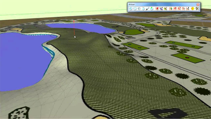
Artisan Organic Toolset is the most recognized sketchup extension that now supports sketchup 2018. This sketchup plugin is available in different languages like Brazilian Portuguese, Chinese Simplified, English, French, German, Italian, Japanese, Russian, Spanish.

Artisan comprises of robust subdivision, sculpting and soft selection tools which can be used for making the followings :-

• Terrain and landscapes
• Furniture
• Characters
• Abstract sculptures and decorative objects
• Fabric, curtains, and pillows
• Rocks, Trees, and Plants
The extension offers the following exclusive features :- Subdivision Surfaces
• Powerful subdivision algorithm to deal with all types of complicated geometries
• Subdivide and smooth selected faces, groups, or components
• Crease edges or vertices to form hard edges
• Knife subdivide tool for producing loops
• Extrude tool to generate loops devoid of interior faces
• Low-poly ‘Proxy Mode’ that automates the process for updating the subsurface geometry as you edit
New Subdivision Features in Artisan
• Accomplish subdivision or smoothing on any selection of faces
• Auto-subdivision of selection boundary faces that leads to cleaner meshes after subdividing
• Instantly preview subsurface geometry before committing
• Proper interpolation of UVs for subdivided geometry
• Quicker subdivision and superior topology
Brush Tools
• Sculpt Brush (sculpt, pinch/spread, flatten, inflate/deflate, smooth/jitter)
• Choose Brush (select faces by performing strokes)
• Paint Brush (paint SketchUp materials on faces with virtual brushstrokes)
• Uniform sculpting mode applying user-defined work plane
• Lock vertices to user-defined work plane
Vertex Transformation Tools
• Soft Selection
• Soft Move, Rotate, and Scale
• Make Planar (XY, XZ, YZ, or best fit)
Mesh Optimization (Polygon Reduction)
• -More rapidly and more powerful as compared to the free Polyreducer plugin
To download the extension, go through the following link extensions.sketchup.com
Artisan Organic Toolset now supports sketchup 2018

~~~~~~~~~~~~~~~~~~~~~~~~~~
Published By
Rajib Dey
www.sketchup4architect.com
~~~~~~~~~~~~~~~~~~~~~~~~~~

Wednesday, January 17, 2018

nz_Edge2Polygon – The newest sketchup extension

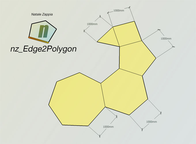
Natale Zappia develops nz_Edge2Polygon, the newest sketchup extension that is available in extension warehouse. It generates polygons by maintaining perfect reference edge lengths.

This extension is compatible with SketchUp 2016, SketchUp 2017, SketchUp 2018. The plugin is ideal for enhancing your drawing and productivity.

nz_PolyhedralJuctions also comprises of nz_Edge2Length and also provides more complicated operations. Here n denotes nth number or sides.

To download the extension, go through the extension warehouse extensions.sketchup.com

nz_Edge2Polygon – The newest sketchup extension

~~~~~~~~~~~~~~~~~~~~~~~~~~
Published By
Rajib Dey
www.sketchup4architect.com
~~~~~~~~~~~~~~~~~~~~~~~~~~


How to Use Tap Measure Tool in SketchUp

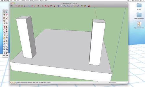
SketchUp tools are designed to give you the simplest way for designing your model. Tap Measure tool does its task of measuring the design without any hassle. It is as easy as dragging and dropping something. But the tool follows a few guidelines that offer you different ways to use the feature. The content discusses them nicely below.

You can activate the Tape measure tool from the Tool manure or large tool set tool. But the most preferred option is shortcut key T from your keyboard that will you to use the feature. The default option of Tap Measure tool is in a guide mode, but you can change it to the measure mode with CTRL key. This tool will help you measure from one end to multiple points as per your need.

Parallel guide lines:

Sketching parallel guide lines needs a few clicks. Click anywhere in the design along an edge you want to parallel with. SketchUp will understand that you want to create a guide parallel. On moving your mouse, you can see the parallel, dashed line.

Linear guide lines:

You can simply create a linear guide with clicking an endpoint or a midpoint and click somewhere along the edge. Your linear guide will be generated.

Guide point:

You can create a guide point with clicking an endpoint or midpoint and click again somewhere in space. A little X will appear at the end of the dashed line – this place is your guide points.

I am referring a video that presents Tap Measure tool in details.

Video Source: Harwood Podcast

How to Use Tap Measure Tool in SketchUp

~~~~~~~~~~~~~~~~~~~~~~~~~~
Published By
Rajib Dey
www.sketchup4architect.com
~~~~~~~~~~~~~~~~~~~~~~~~~~

Tuesday, January 16, 2018

Message in a bottle: A search in truss automation

A truss is presented as a framework for designing and construction field like a structure of elements which act as a single component though in combined situation and provide the support for the bigger structures. Naturally the design of an architectural truss is dependent on various calculations counting the effects of physical forces like weight, compression, material limitation etc. and the calculations are till now alarming and time consuming.

Robert Kovacs and his research team at Hasso Plattner Institute has been inventing to find a process of automating those calculations and there search and efforts have ended after creating TrussFab; it is a SketchUp Extension that make the 3D printable truss elements popular for the SketchUp users. This TrussFab helps users for rotating SketchUp geometry into a truss network which can smoothly be put together in real life with the recycled materials. This truss network with the recycled materials provides the users the ability for gathering trusses to their own projects easily, faster and reliably.

About the project: It is a unique project and thinking that has started two years ago at Hasso Plattner Institute and has attracted many undergrad and grad students to work here, the main team consist the following members: Robert Kovacs, Anna Seufert, Ludwig Wall, Hsiang-Ting Chen, Florian Meniel, Willi Muller, Sijing You, Maximilian Brehm, Jonathan Striebel, Yannis Kommana, Alexander Popiak, Thomas Blasius and Patrick Baudish.

Robert and the Truss Fab Team have highlighted some points on their works and they have started working on the plastic bottles and have created so far some amazing projects.

Idea of TrussFab: Robert‘s first project was the Protopiper at the Hasso Platter that focused on prototyping room-sized objects at perfect scale. After that the team has planned to take forward the idea of large-scale personal fiction for more functional objects and the result was complementing small 3D printed parts with ready-made objects that became plastic bottles. They also realized the need of the key design principle is always fro closed triangular contours, trusses or otherwise the connectors or the bottle will break.

The underlying physics of the forces: Truss structures are containing of triangles arrangements; that’s why the structures block deformation than only the individual object. The main strength of trusses is that they turn side forces or bending forces into tension and compression forces with the length of the edges or members.

3D printed hubs in the extension: Robert and the Truss Hub team has rated many hub designs proficient to hold the bottles or any objects together and they also used a threaded-snap connector pair for each edge. After that they settled on a design which can adjust various kind of objects (here bottles) and easily apply the 3D print; initially this design has the connector with only a simple projection.

Incorporating engineering functions into the application: TrussFab and Robert have the main goal to give a chance to the beginner users for building structurally firm large-scale things in just some minutes. The fundamental design principle behind TrussFab is well known in architecture that is less understandable in everyday life and the 3D printers can manufacture more objects with a better quality. The observation of materials and the wall thickness of the designs often fail as the forces grow numerically with the size of the object; it can overcome by implementing truss-specific functions to help users to create sturdy structures. In addition the editor of TussFab offers primary shape fundamentals as the elementary formed trusses, tools that can create large beams in the form of trusses and tools to tweak the shape of structure in the time of maintaining inflexibility.

The most inspiring structure: The largest structure according to Robert and his team was a 5m high pavilion for the CHI’17 conference that was made more than 1500 bottles and 191 3D printed hubs and was designed by the architect Oanh Lisa Nguyen-Xuan with the help of TrussFab’s editor.

The process of extension self-validate larger structures: At first the effect of weight of any structure placed upon the Structure is computed by TrussFab and they use the software here. The software generally finds the flaws in the truss structure and searches the parts which are not locked properly in place by other members can be subjected to shear or bend forces. In case, if such kind of forces can be found then the software would place additional balancing member; then the software examines the capability of the structure. The software analyzes the applied forces through finite element analysis for every member of the structure and shades every member accordingly.

Digital tools used in TrussFab: SketchUp is the most used tool and far most the best software for designing and planning the models in TrussFab. According to Robert, SketchUp is a vast and available platform for 3D projects that help them to make their project easily in 3D editor. Besides SktechUp, they use some additional tools also like Karamba 3D to estimate the forces inside the structures and OpenSCAD for creating the precise hub geometries for 3D printing.

Use of bottles in structures: TrussFab uses the normal soda pop bottles as a recycled product to make structures of their models which they buy from the local stores of Germany. They used refillable bottles for higher structural stability that provides them strength and make strongest and on the other hand the softer bottles are inflated to get the same strength.

Article Source: blog.sketchup.com
~~~~~~~~~~~~~~~~~~~~~~~~~~
Published By
Rajib Dey
www.sketchup4architect.com
~~~~~~~~~~~~~~~~~~~~~~~~~~

Friday, January 12, 2018

How Accurate Are SketchUp Shadows?

Shadows add a real essence to your design. The same is true for your 3D modeling also. SketchUp, being the most popular 3D modeling design application, has come up with different shadow effects required for creating the environment as per the sun movement. Now the question is – how accurate are SketchUp shadows? The application follows a general rule and helps you add shadows the way the sun casts naturally. Mimicking the real-world shadow is not easy. But, SketchUp allows you to observe how the real shadow enhances the visibility of an object.

With SketchUp, you can calculate the best angle for adding shadows to your design. Below are a few features that are commonly available in the application.

• The latitude and longitude of a model.
• Cardinal orientation (north, south, east or west) of a model.
• Time zone selection


The shadow feature of SketchUp only brings out the general rule of how the Sun casts a shadow as per the geo-location. Since you cannot adjust time in the application, getting the right show effect is a bit difficult.

To add shadow effects to your design, you must put your model in geo-location. In SketchUp Pro 2017, you can easily import terrain to your design with the Add Location Tool. The steps can be done manually, as well. Follow the steps below:

Window > Model Info > Geo-location > Set Manual Location > Latitude and Longitude

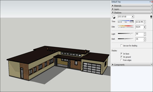
Once you make your model Geo-located, the sun creates shadow naturally on your model. It creates your design more realistic. How to turn on Shadow in SketchUp:

SketchUp turns off shadow feature by default because shadows are consuming more computer processing ability. You can turn on shadow manually by following the steps: View > Shadow

To get a complete control over the tool, open the shadow feature on a default tray and customize everything that is needed. To add the time of the day, you can either drag the time slide along the timeline or insert a time in the time box. Steps will be the same for adding a month and day – dragging the date slide or inserting the date in a date box.

Customize shadow:

Besides the above-mentioned tips, there are a few things that help you customize the shadow attributes the way you want. The tips are given below:

• In the upper left is a display shadow button for switching the shadow effect between on and off.
• The time-zone tab allows you to select a new time zone. If the design is geo-located, the time showing in the model is accurate.
• The light slider is for changing the intensity of the light. This way, you can lighten or darken your model.

• The Dark slider is controlling the intensity of the shadow.
• On Face slider helps you cast the shadow of the one face on the other face logically.
• On Ground slider is for casting a shadow on the plane ground.
• From edges denotes the edges of the face can cast a shadow.


The SketchUp Shadow tool is amazing to use as you can change the effect of shadow as per the movement of the sun. All advanced functions along with the basic ones will help your make your design as much real as required.

Article Source: blog.sketchup.com

How Accurate Are SketchUp Shadows

~~~~~~~~~~~~~~~~~~~~~~~~~~
Published By
Rajib Dey
www.sketchup4architect.com
~~~~~~~~~~~~~~~~~~~~~~~~~~

Thursday, January 11, 2018

How to make complex shapes with various skethchup plugin

n this sketchup video tutorial, you will learn how to generate complicated shapes with the use of different types of sketchup plugins like Extrude Tools, Flowify, Mirror, Split Tools, Vertex Toos, JHS POWERBAR. All these plugins are available in SketchUcation Plugin store and extension warehouse.

Extrude Tools – A series of toolset which can be used for extruding edges into meshes etc.

Flowify – A powerful extension that twists groups or components along a quad surface. The source geometry is associated with a projection grid and the geometry is then mapped onto a quad target surface.

Mirror - Mirror the selected objects by choosing 1/2/3 points to describe a point/line/plane: then select to retain/eliminate the original objects.

Split Tools - Integrates the Split-Donut, Split-Sausage and SplitUp tools into a single toolbar of face splitting tools.

Vertex Tools - Manage each vertex with this vertex editor for SketchUp. Soft selections are obligatory organic modelling and the manipulator gizmo provides you great control at the time of modelling.

JHS POWERBAR - This tool is unique in that it’s actually a collection of powerful extensions from other developers, like TIG, Thom Thom, Rick Wilson, Christina Eneroth, and more.

Watch the video to learn the process for producing complex shapes with skethup.
Video SourceTutorials Up


~~~~~~~~~~~~~~~~~~~~~~~~~~
Published By
Rajib Dey
www.sketchup4architect.com
~~~~~~~~~~~~~~~~~~~~~~~~~~